Our eyes are bombarded with text all day long but most of us don’t usually put much thought into what that text actually looks like. That is, we don’t until we lay sights on some fine looking graphemes with their voluptuously weighted lines and copious spacing on the page. Then all of a sudden, we’re reminded of just how satisfying beautiful typography can be.
Our obsession with typography comes with a long history stretching as far back as written language itself. Since the days when writing involved hammering symbols into stone, typographers across the ages have been playing with the style and appearance of words in an endless balancing act between art and utility. So put on those reading glasses while we thumb through the pages of the history of typography.
The very beginnings
Evidence of written language stretches as far back as 20,000 BCE France where pictographic paintings of animals and people inside the Lascaux Caves conveyed messages about hunting and rituals. Fast forward to the first written languages, Egyptian hieroglyphics and Sumerian Cuneiform. Both arguably take the reigns as the first well-spring of the written word dating prior to 3000 BCE.
But while visually complex Egyptian hieroglyphs made for great wall art inside a pharaoh’s tomb, the plebs needed something more readable to use in their everyday back-and-forth. In time, they created a simplified version of the glyphs and took the very first baby steps toward using symbols to represent a sound rather than whole concepts.
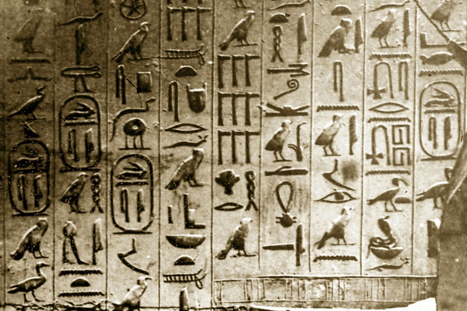
Egyptian hieroglyphs carved into a stone wall
By 1600 BCE, Phoenician traders picked up on what was happening in Egypt and took it over to Phoenicia where they tweaked the symbols into the world’s first alphabet. The idea spread like wildfire across the Mediterranean and the writing system became the ancestor to most modern alphabets throughout Europe, the Middle East, and Northern Africa.
Upon reaching Greece, the Greeks tweaked it so one symbol equalled one sound and all vowels became standalone letters – just like the English alphabet today. In fact, the word alphabet itself is a mashup of the first two Greek letters, alpha and beta.
Stylising the written word
From the earliest days, handwriting played a vital role in how people interpreted the tone of messages. For instance, Roman scribes might write government documents using more carefully drawn out strokes to match the formality of the situation at hand. But for the military general looking to scrawl out an urgent message in minutes, Roman cursive proved the expedient option.
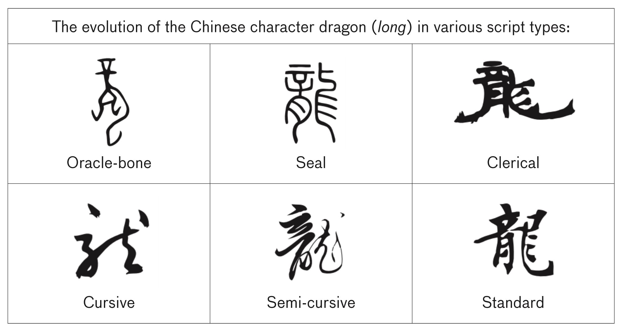
The invention of different script styles to fit the occasion can be seen in languages across the world and throughout time. In the Far East, calligraphers evolved Chinese characters over time while also creating categories of scripts that vastly changed their look for more effect. Some styles catered to readability while others abstracted the image to almost unrecognizable forms.
Today, we’re all used to seeing slight variations in the weighting of the lines in lettering. It makes words more readable and pleasant to look at. So it’s hard to imagine the aesthetic detail was borne out of necessity. In the days of 14th century Renaissance Europe when pens were made of quills, upstrokes were harder to pull off and so came out weaker and lighter looking than the heavier, ink-laiden downstroke. And some of those old patterns of variation are still preserved in modern fonts today.
The word in print
The printing press made its debut in the 15th century and with it came a brand new era of mass communication. The impact can’t be overstated. Historians have argued the printing press heralded an “alphabetic monopoly” – a societal mindset shift where information was now absorbed through letter rather than speech and imagery. Aesthetics – particularly religious imagery – lost their once prominent status while coherent lines of argument became a highly sought after commodity.
By the time of the Industrial Revolution, the printed word became all about communicating with the masses through posters, newspapers, signs, and advertisements. Institutions experimented wildly with typography and defined themselves through iconic fonts. The British paper, The Times, bestowed Times New Roman to the world. And the highly stylised, geometric Art Deco typography of the early 20th century became a key aesthetic of an entire era.
Typography in the Digital Age
With the digital age came an explosion of new typefaces available to everyone…eventually. But first, we had to suffer through the font wars of the 90s when companies competed fiercely to protect their proprietary technologies. Slow advances toward compatibility along with changes to font licensing and distribution ultimately led to the democratization of fonts on the internet by the 2000s. The end result is the huge diversity of fonts we see today and the creative freedom for graphic designers to play with text like never before.
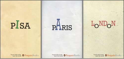
An outstanding example of typography as art. Book covers by Penguin books.
In summary
With all the choices available today, it’s an impossible feat for a graphic designer to try and familiarise themselves with every typeface and style choice out there. What’s more crucial is to have a firm grasp on typographic styles, their uses, and origins. And there’s no doubt we have a rich human history full of experiments and advances in typography on which to draw inspiration. It’s a wealth of collective knowledge every graphic designer should understand and tap into as they seek solutions to contemporary typographical challenges.